Designing a Dashboard to Visualize Ad Performance Metrics
I translated static reports of complex ad performance metrics into a cohesive interactive dashboard for business development teams at Media.net.
My Role:
User Experience Designer
Collaborated with:
Business Developers, Software Engineers
Organization:
Media.net (Global Ad Tech Company)
Tools Used:
Figma, Power BI
CONTEXT OF BUSINESS SPACE
What does Media.net do?
Media.net is a global advertising tech company that connects publishers and advertisers. By utilizing contextual targeting, Media.net tailors advertisements to match the content of the websites they are hosted on instead of tracking user data and behavior.
Network of Publishers
(Forbes, NY Times)
Owns websites/digital
real-estate and wants
to monetize it.
posts ads
Media.net
Matches and decides
which ads are displayed
on a publisher's website
based on context and bidding.
pulls ads
Network of Advertisers
(Yahoo! Bing)
Bids on digital real-estate
to purchase it and display
their ads to an audience.
DEFINING TARGET USERS
Who is the dashboard for?
Internal Business Development Teams at Media.net.
What is their primary task?
Business developers focus on maximizing profits by efficiently filling available ad space with the most relevant advertisements.
DESIGN CHALLENGE
How might we visualize ad performance metrics such that business developers can efficiently optimize ad supply and demand?
DEFINING core features of the dashboard
User Need:
Business developers operate in distinct workstreams focused on profit maximization and ad placement optimization. Depending on their specific role and seniority level, each user requires a tailored view of ad performance metrics.
Design Solution:
Multiple pages, global navigation and filter components to organize distinct sets of metrics with varied viewing options.
Navigation Menu

Filters


User Need:
Business developers need to derive actionable insights from the charts visualizing ad performance metrics.
Design Solution:
Data charts on a dashboard page collectively guiding business developers to areas requiring immediate action and further investigation.

Trend A
in Chart 1
+
Trend B
in Chart 2
+
Trend C
in Chart 3
implies
Take Action X
Trend D
in Chart 1
+
Trend E
in Chart 2
+
Trend F
in Chart 3
implies
Take Action Y
User Need:
Data needs to be easily scannable at a glance; enabling business developers to quickly evaluate key metrics and trends before further investigation.
Design Solution:
KPI Card Components: Key metrics highlighted using visual accents and card components for immediate recognition.
Minimal Data Density: Limited data charts visible at a glance to reduce cognitive load and data fatigue.

User Need:
Business developers transitioning from static reports need a smooth onboarding experience so they can quickly integrate the new dashboard into their daily workflow.
Design Solution:
Trend-to-Action Playbook: A contextual guide that helps users interpret visual trends and translate dashboard data into direct business actions.

INFORMATION ARCHITECTURE
I organized the ad performance metrics into distinct pages tailored to meet the diverse requirements of business developers, depending on their specific role and seniority level.
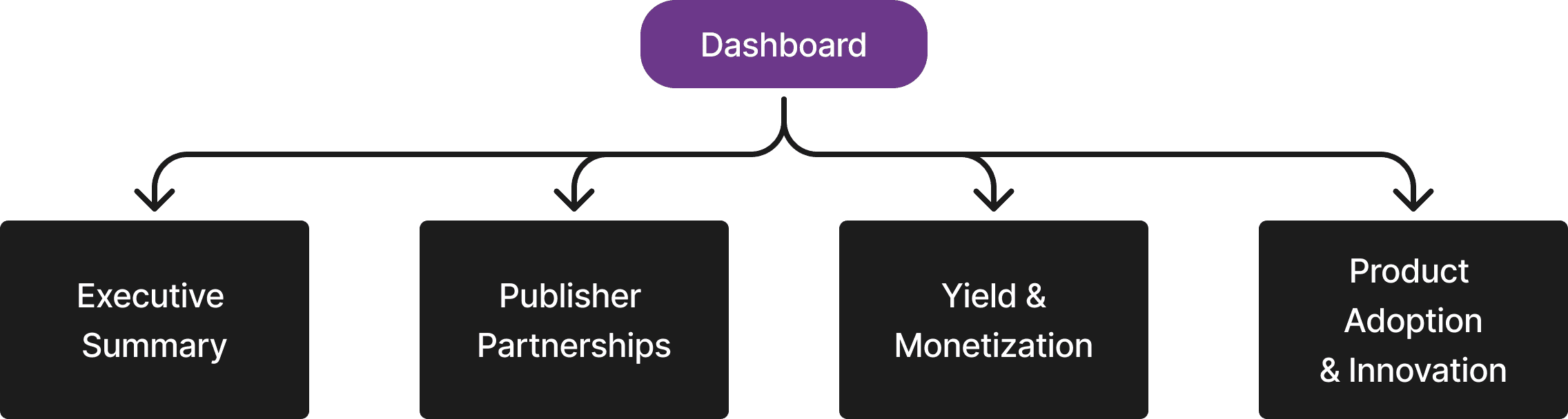
Executive Summary for Leadership & VP
Needs high-level KPIs to make macro decisions on budget allocation, expansion strategies, and team goals.
Publisher Partnerships for Senior Managers & Directors
Needs a bird's-eye-view of publisher account health across the entire portfolio. They need to identify which high-value partners are declining so they can step in with strategic solutions, and which are growing so they can pitch expansion deals.
Yield & Monetization for Associate/Operational Business Developers
Needs to dig into daily revenue fluctuations, debug poor ad placement performance and technical issues. They need high-density, highly tactical metrics.
Product Adoption & Innovation for Product-focused Business Developers
Needs to track performance of new features and how well they are being adopted in the market.
Deep dive into the 'Yield & Monetization' page.
I designed prototypes that incorporated native Power BI features and collaborated early on with software developers to ensure technical feasibility. The final dashboard was implemented in Power BI.
Prototyping Tool: Figma
HIGH-FIDELITY PROTOTYPES

Navigation & Filters
Page Navigators

Page Level Filters

Field Parameter for Multi-View Data Chart
Drill Down Feature

Actionable Insights from Data Charts
Primary task of the Yield & Monetization Team:
Maximize revenue by regulating 'price floor', the minimum bid an advertiser needs to make to purchase an ad space.
Ensure technical functionality, maintain audience quality, and manage visual ad placements to optimize visibility.
Key Metrics Visualized on Dashboard
Price Floor
Minimum bid an advertiser has to make to purchase an ad space.
Revenue
Total gross earnings generated over a specific period of time.
Ad Impressions
Total number of times an ad is successfully displayed on a website.
eCPM
Revenue earned per 1,000 ad impressions.
Fill Rate
Percentage of ad requests that successfully display an ad.
Viewability
Percentage of ad impressions that are actually seen by a user.
Ad Latency
Amount of time it takes for an ad to load on a page after a request is made.
IVT Trend
Fraudulent or non-human ad traffic (like bots, spiders, or accidental clicks).
Step 1: Check Chart 01 for Revenue, eCPM and Fill Rates

Step 2: If both eCPM and Fill Rate are low
Check Chart 02 for Viewability, Ad Latency, IVT

Step 3: If eCPM is low and Fill Rate is high
Check Chart 03 for Price Floors and Viewability

Step 4: If eCPM is high and Fill Rate is low
Check Chart 02 and 03 for Price Floors, Win Rate and Ad Latency
Key Metrics Highlighted with Card Components

Trend-to-Action Playbook
